
Arroyo Mecinas
Brand Identity, Visual System
Arroyo Mecinas is a law firm specialized in tax and legal consulting, with a presence in multiple cities. The branding strategy focused on repositioning the firm by leveraging the recognition of its two founding partners, who were already well-known in their respective regions. The goal was to create a brand identity that projected professionalism, transparency, and adaptability.
The identity unfolds in multiple versions:
Arroyo Mecinas (balanced hierarchy)
Mecinas Arroyo (inverted hierarchy)
Arroyo only or Mecinas only (for local or niche applications)
With or without the descriptor "Bufete Jurídico" depending on the usage context.
This flexibility enables the brand to maintain visual unity with regional adaptability.


My Role
I developed the visual identity system, based on the concept of a mutant brand, where either surname could be highlighted depending on the geographic location or context—without losing visual coherence. The design was applied across stationery, digital communication, signage, and institutional materials.
The Challenge
The main challenge was to create a flexible system that allowed the more relevant surname to be highlighted in each city, while maintaining a consistent graphic structure. The firm wanted a visual language that was elegant and sober—moving away from legal clichés—yet communicated experience, order, and trust.
The Solution
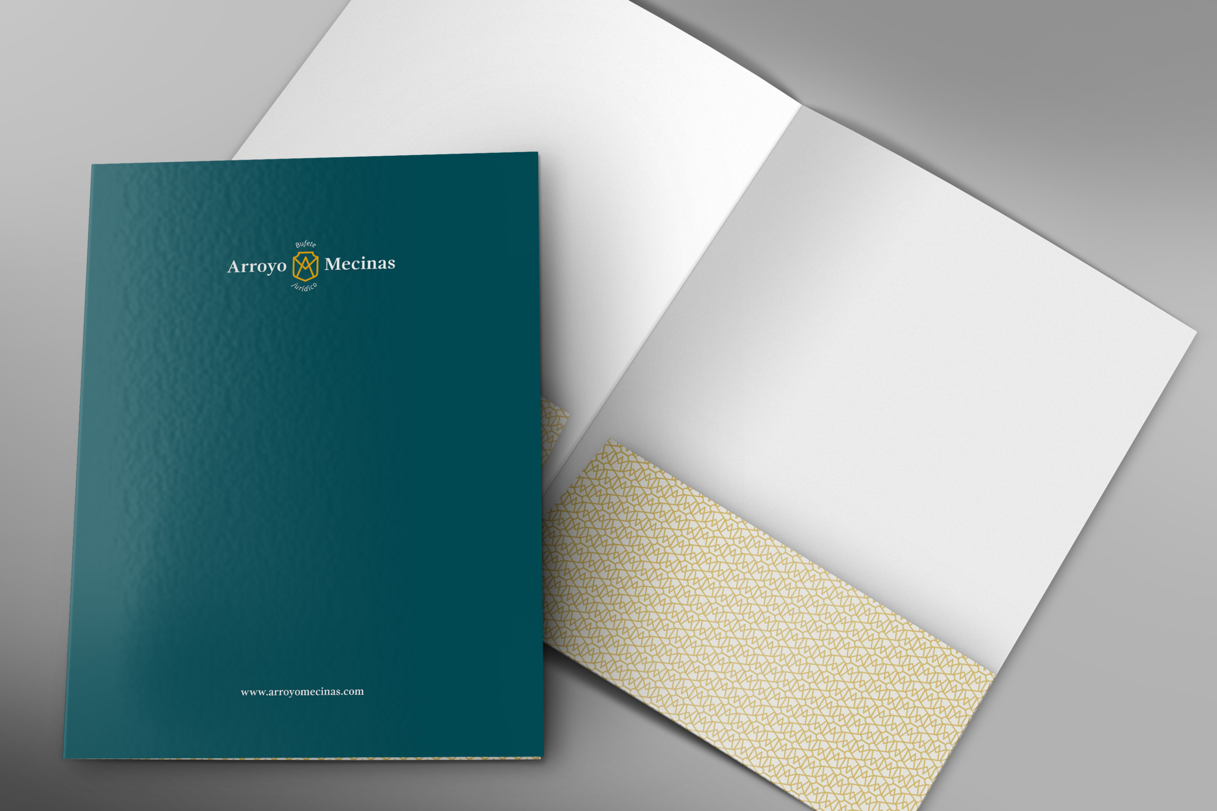
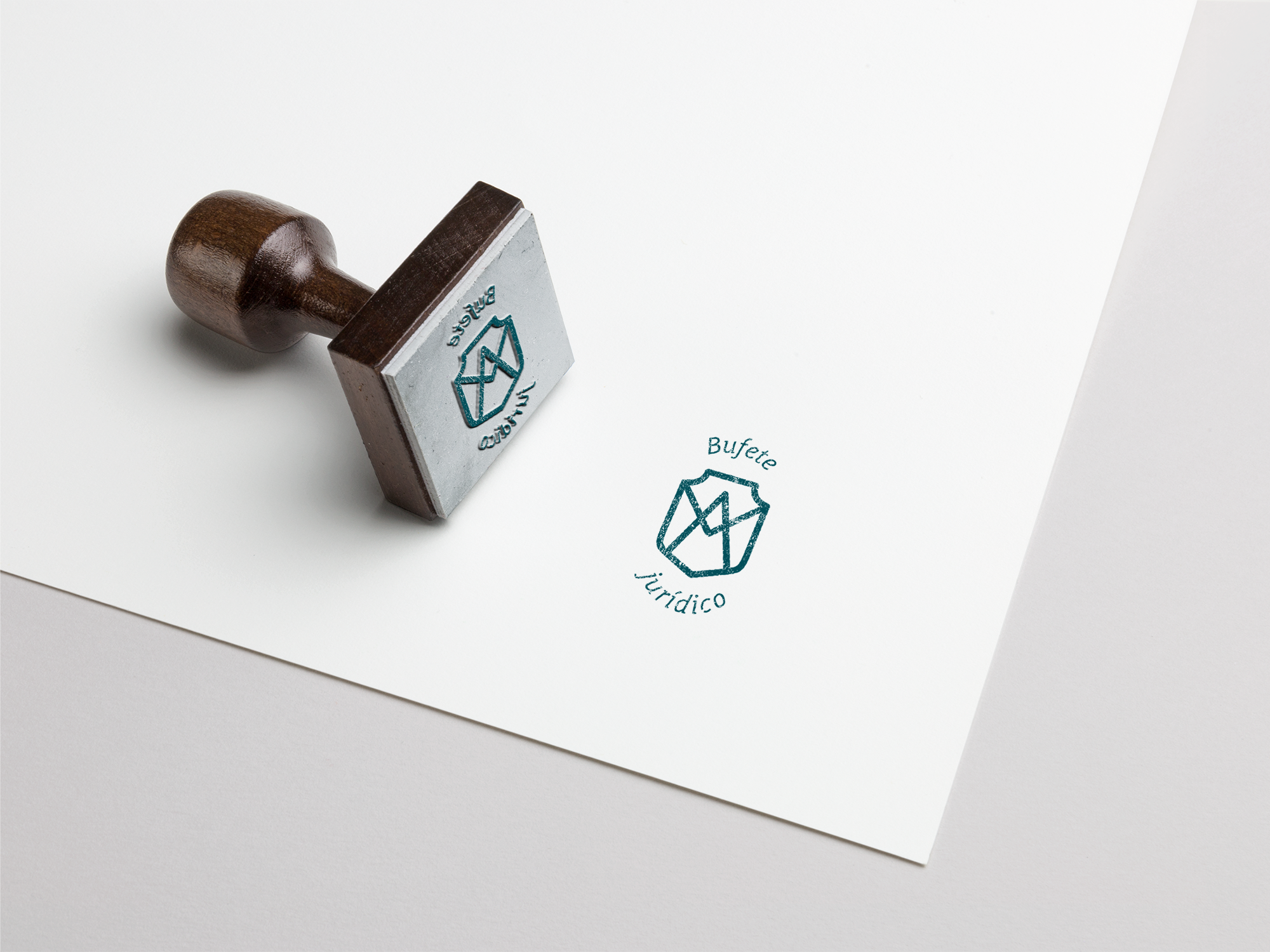
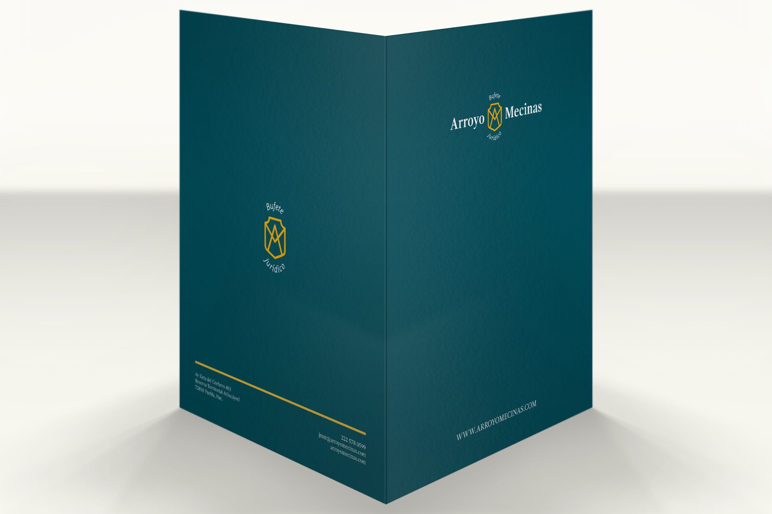
The solution was a modular and adaptable logo system, with a central symbol that merges the initials A and M into a shield shape, evoking protection, integrity, and tradition. This symbol remains constant across all variations, while the hierarchy and order of the surnames adapt visually. A contemporary serif typeface was chosen to convey authority and seriousness, paired with a sober color palette in deep green and gold. The visual system includes both horizontal and vertical compositions for maximum versatility.
The Impact
Thanks to this system, the firm can strategically adapt its image across different contexts, reinforcing each partner’s personal brand while maintaining overall cohesion. The design projects a modern, professional, and trustworthy image, helping to strengthen current client relationships and open new opportunities.