
Grupo SC
Brand Identity, Visual System
Grupo SC is a real estate development company that designs and builds housing projects with a tangible value proposition aligned with what people truly seek in a home. More than construction, they aim to create spaces that are solid, professional, creative, and innovative—offering not just buildings, but places to live, grow, and connect.


My Role
I was in charge of the brand redesign and visual identity system for Grupo SC. My work focused on translating the company's vision into a cohesive and elevated identity, using modern visual elements to position them as a high-value, forward-thinking developer in the real estate sector.
The Challenge
Grupo SC’s existing brand was outdated and no longer reflected the sophistication and innovation behind their housing projects. They needed a refreshed visual system that would express strength, elegance, and the emotional value of home—while standing out in a competitive market.
The Solution
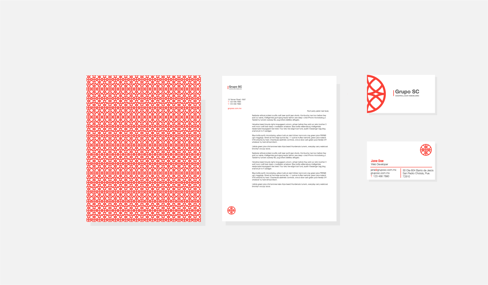
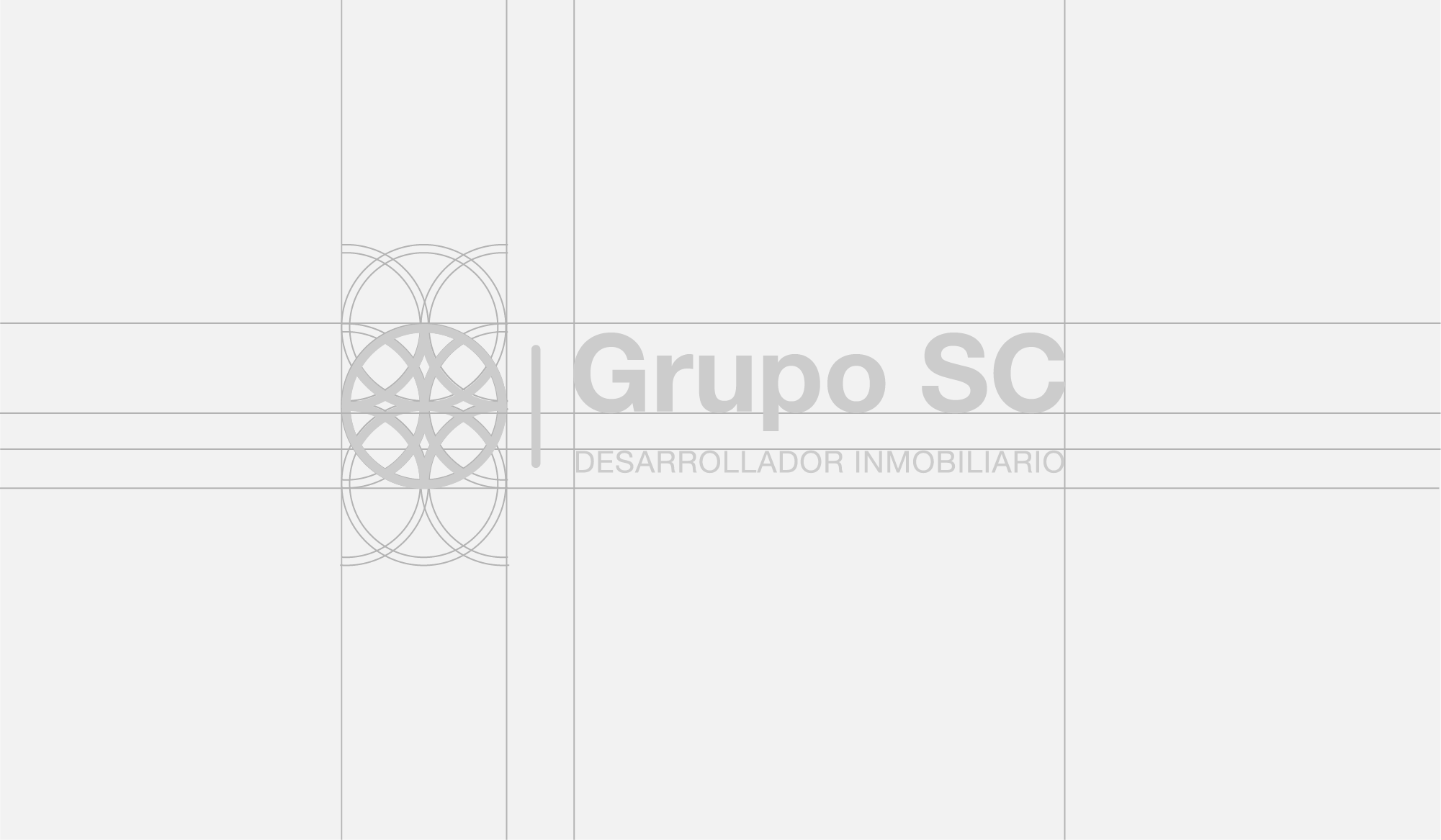
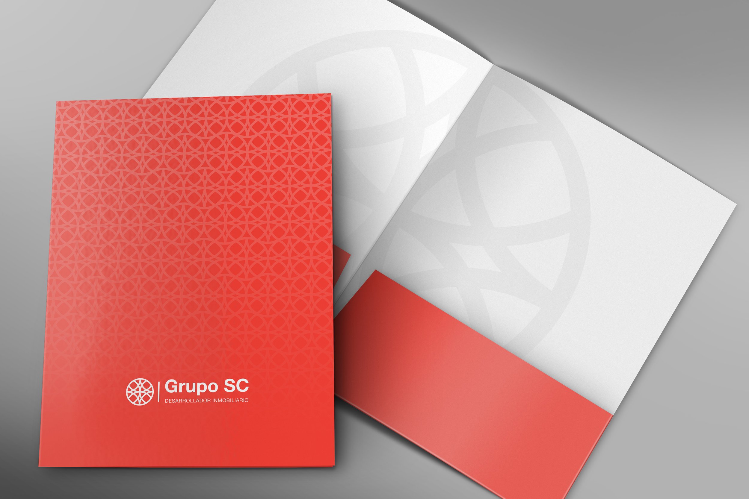
The concept of "home"—derived from the Latin focus, meaning fire—became the central inspiration for the identity. Just like ancient families gathered around a sacred fire at the heart of their homes, Grupo SC creates spaces where life, warmth, and protection converge. I created a refined visual identity using a strong yet minimal color palette, suggesting power and sophistication. The typographic system, built on Helvetica Neue in various weights, gave flexibility and structure to the brand. Visual materials were designed to balance modernity with a sense of emotional connection and trust.
Impact
The new identity positioned Grupo SC as a premium and innovative real estate developer. It helped communicate their core message more clearly to clients and partners, reinforcing their role as creators of not just buildings, but meaningful homes. Internally, it also brought cohesion and pride to their communications and brand culture.